
 Helvetica
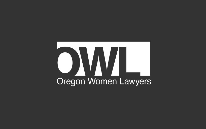
(a modern wordmark logo)
This wordmark logo uses the best font in the world. Helvetica is like the Macintosh of fonts but even more extraordinary than that. It simply has no equal. I won’t gush about my love for this font, but if you are curious “Helvetica The Movie” is a great introduction. In a nutshell, Helvetica is the most thoughtfully designed and universally trusted font in the world. It is so great it’s popularity does not fade despite it’s popularity, especially in a world with an insatiable appetite for “new and improved.” It is a classic with a great shelf life.
Helvetica is a modern font. Helvetica works best when you don’t get in the way too much and just let it be the boss. This design is being respectful to the modern simplicity of the font. Reversing the OWL (knocking out) text and letting the letters break out of the usual grid margin makes for a dynamic composition that captures the eye. We are so familiar with this font and it is designed so well that we trust it to go into unfamiliar territory. Lining up the inner (negative) space of the O to the left mitigates the overall awkwardness of the letter stacking.
Truth be told, the letters O, W and L are not fun to work with. They are among the most gangly. It is a challenge to make them look good together and many fonts are not up to the task.
Reverse
Scale

NEXT
Menu
Intro
demo1 Helvetica
demo2 Roman
demo3 Bebas
demo4 IconA
demo5 IconB
Birds Eye View