
 Icon A
A quick word about lawyer logos. I had sworn off all lawyer logos until I was approached by OWL. The truth is I was so tired of being asked to design a set of scales or columns that I just couldn’t do it anymore. The scales and columns are overplayed. If the main objective of corporate identity is becoming memorable, then adhering to a cliché like the tired scale and column is the antithesis of that.
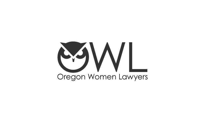
You have a wonderful opportunity that you need to leverage. YOU HAVE A GREAT NAME! “Oregon Women Lawyers,” is pretty powerful stuff. The fact that you can take the first letter of each word and make “OWL” (the coolest bird ever) is an amazing streak of luck. My first thought was, “We have to leverage that!” My second thought was, “How do you do that and not make it silly?” Most of the owl examples I see seem too cartoonish and not serious enough for lawyers. You undermine the image and true wisdom of an owl by putting glasses on it to make it look smarter. Anyone that has been close to a real owl is moved by it. They inherently seem to know more than us and one can’t help but feel a reverence and respect being in their presence. Owls hold a special place to us in Oregon. I really can’t think of a better mascot for you.
This is the first of two icon based logo concepts.
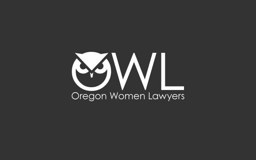
Reverse
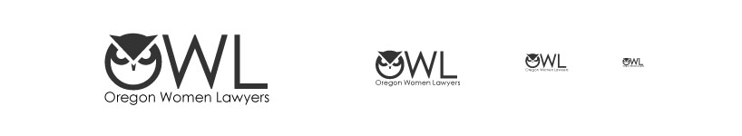
Scale
NEXT
Menu
Intro
demo1 Helvetica
demo2 Roman
demo3 Bebas
demo4 IconA
demo5 IconB
Birds Eye View